User Research
I began this process with a simple goal statement:
“My user is a twenty-something who wants to book a flight using an app.”
I began this project by interviewing and watching some users who fit my target audience use a flight booking app that already exists. What I found was:
- All my users were in their 20’s
- All users worked retail hours
- All users had limited budgets
- All users preferred doing their research on their smartphones
- Users cared most about finding the lowest cost
- Found it frustrating when they got lost in the process
- Described the process as cluttered
I ended this research phase with a refined goal statement:
“My user is a retail employee in their twenties who wants to book a cost effective flight with an app on their phone.”
Wireframes
I began by sketching a simple wireframe for the screens that would walk users through the process of booking a flight.

The most important thing to my user is how much they spend. The first screen they see is clean, simple, and asks them the most relevant question.

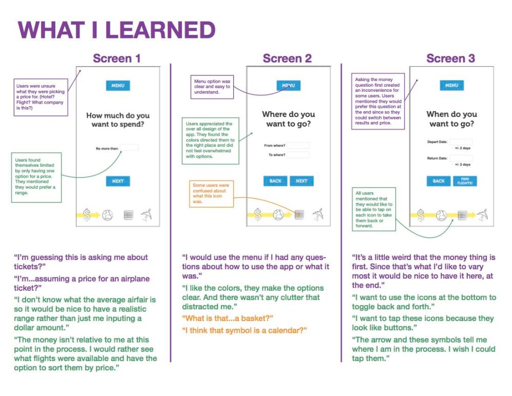
Screen 2
The second screen asks them where they are coming from and where they are going. The bottom menu on each screen shows them where they are in the process of booking their flight.

The third screen asks them for their travel time frame and gives them the option of buffer days in the event that flights are cheaper on surrounding days of desired travel.
Prototype
The next step in the process was to turn these wireframes into interactive prototypes using Axure.

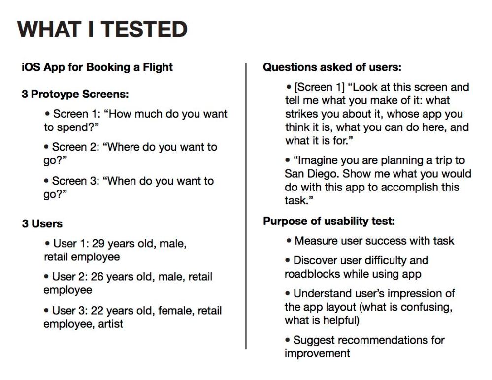
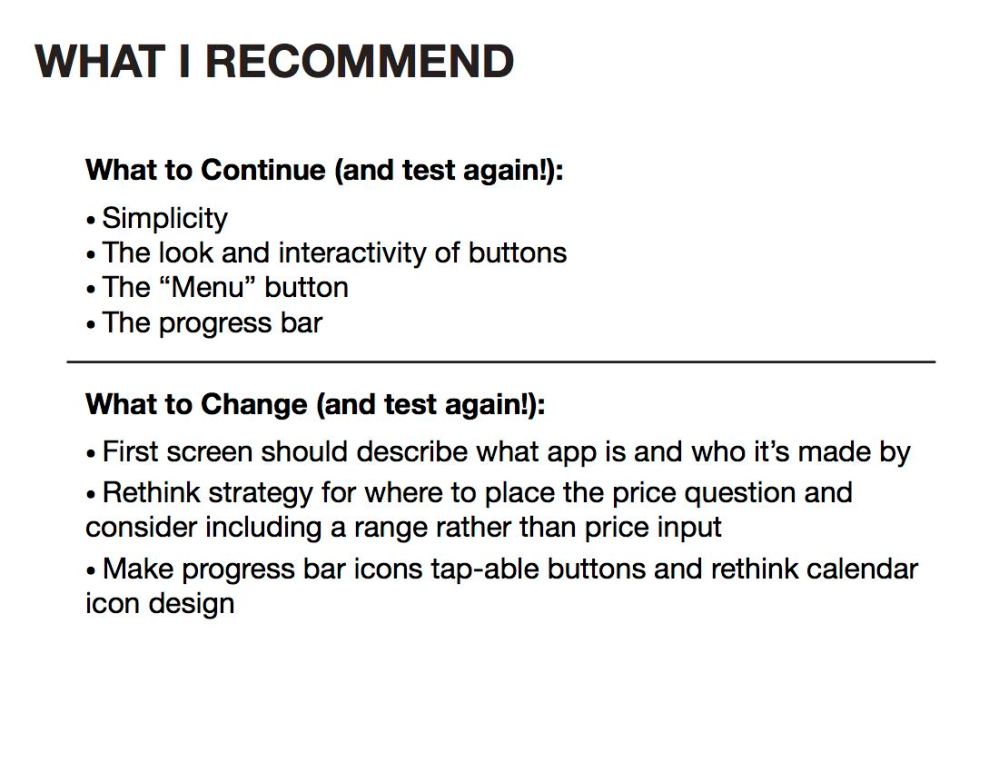
Evaluation & Usability Testing
After completing these prototypes I performed a formal usability test with the same group of users I initially tested. These were the results: