Methods Used
Competitive Audit
Directed Storytelling
Journey Mapping
Feature Cards
Kano Analysis
Annotated Wireframing
Tools Used
Pen & Paper
Google Forms
Adobe Illustrator
Keynote
The user is an employee of The Nerdery who wants a quick and easy way to reserve adequate conference rooms for internal and client meetings.
The Challenge
The Nerdery is a large and successful software engineering company with many teams working on various projects. Each of these teams have a lead who often needs to schedule last minute meetings with employees and sometimes with clients.
The Nerdery’s campus consists of two large buildings each with many conference rooms varying in size and amenities. Currently Nerdery employees (usually team leads) use Google Calendar to create events and reserve rooms. This works well for putting meetings on their calendar and alerting employees of these meetings, but problems arise when trying to find a room that meets their needs in terms of size and amenities.
The Approach
Through creating a simple room scheduling responsive web app (Room Nerd) that integrates the Google suite, the employees at The Nerdery have a quick and easy way to reserve rooms that does not interrupt their current system.
These annotated wireframes are the final deliverable for this project:
Annotated Wireframes for Room Nerd
Competitive Audit, Contextual Inquiry, & Directed Storytelling
Through a competitive audit of other scheduling apps I observed that the most popular and highly rated web and native apps were simple with a few key features. They had a simple e-mail login system, helped avoid double booking by integrating with current business’ calendar, were available on desktop and mobile, and allowed for alerts/notifications through e-mail about upcoming reservations and events. They also all had an administrator account which is used to add and edit specific rooms.

Knowing what features were typically helpful for situations like The Nerdery’s I was able to ask effective questions during a contextual inquiry with 3 employees at The Nerdery in one of their many conference rooms. I was able to hear about what a typical day looks like for each of them and observe what their current system looks like.
Journey Mapping & Feature Cards
This directed storytelling was incredibly helpful in identifying their biggest pain points and beginning the process of brainstorming solutions. Below is a journey map of a typical day for one of these employees in their current workflow, and a journey map of the same employee in an ideal workflow:

Current Experience
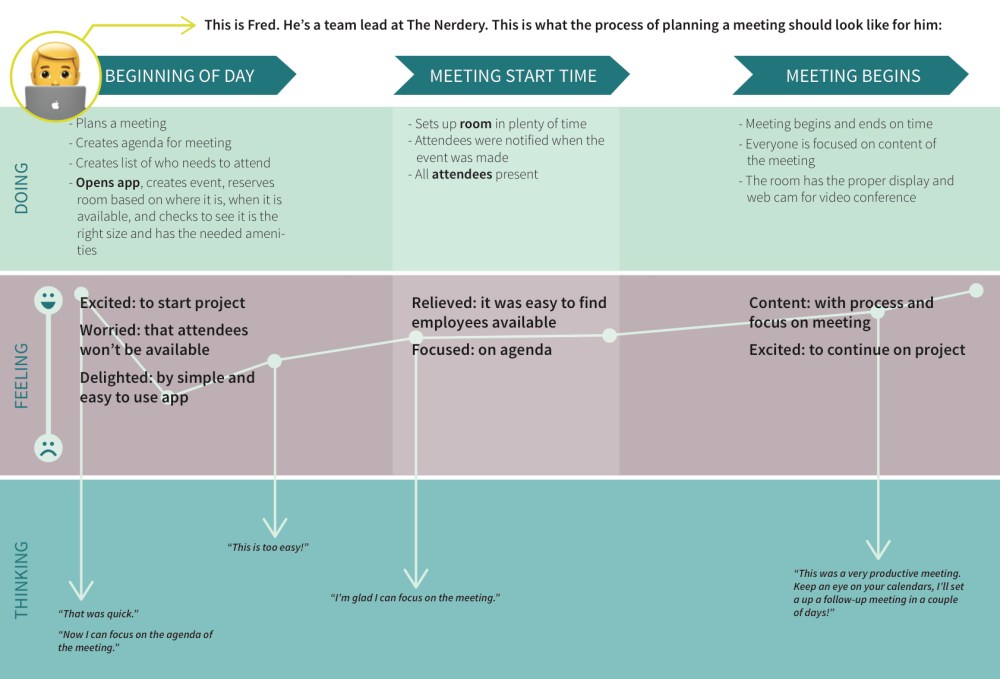
Ideal Experience
After doing this journey map I had a much better idea of the ideal features I would like this web app to have. I threw together some wireframes of the main features I would like to add. Here are a few:
I used these feature cards for two reasons:
- For developers to look over and give me a rough estimate in hours about how long these features might take. The biggest take away from this was that if our users needed the Google suite integrated with this app it would take up a significant amount of the hourly budget. I found that this was a valuable enough investment for our users and was important to implement.
- For our users to looks at in a short survey to understand what features they found functional, what features they found valuable, and what features fell into the ideal spot of both functional and valuable! This method is called Kano Analysis.
Kano Analysis
The Kano Analysis gave me insight into what features appealed the most to my user. The items that fell into the “Must Be” or “Must Have” category were:
- A log in/integration with Google
- A quick way to look at what rooms are available
- A quick way to book a room
- A way for an administrator to add/edit room amenities & details
Because I had spoken with the developers about how long the Google suite would take to integrate, I knew I could only focus on these 4 features moving forward. There are other interesting and appealing features I would like to add to a v.2 of this web app. For the full Kano Analysis with more features, click here.
Annotated Wireframes
All of this work lead to my final deliverable: annotated wireframes. I decided that the web app would be called “Room Nerd” and that it would have two main users:
- Administrator: add/edit rooms
- Main User: book rooms/edit reservations
The flow of this app is very quick and very simple. It allows admins to add to their own database with the various rooms at The Nerdery as well as details about those rooms. With this data available to the main user, they are able to log in (and stay logged in) with their current Nerdery e-mail and are immediately in a form that allows them to begin reserving their room. Two screens later and the main user is already seeing what rooms are available and details about those rooms.
Click here to see annotated wireframes for Room Nerd.
And that’s Room Nerd! A quick and easy way for employees of the Nerdery to reserve adequate rooms for their important internal and client meetings.
What was challenging?
This case study can be described with one word: rapid! From the competitive audit to the creation of feature cards all happened in two days! While this was extremely fast, I found it incredibly energizing and effective to get straight to the highest priority needs of my user. Oddly enough this actually made the process much simpler as I just didn’t have enough time to get bogged down by little details or distractions that I would like to add.
What did I learn?
Speaking with developers about features and how long each one would take was very eye opening. I found that there were features I had anticipated to take a long time that were actually very simple, and I also found that there were features I thought would be simple that were actually quite complex and could take several months to deploy (anything to do with geolocation or mapping!). While this could have been discouraging, it actually gave me a lot of good insight and helped me once again navigate to what was most important for my user.
What would I do differently next time?
While I found the Kano Analysis fascinating, I am ready to try it again to ensure I understand the entire process. I think it added valuable insight into this project, but I think there was more insight that could have been gleaned from it.
I also would like to have created a simple paper prototype of my feature cards and watched my user go through the simple flows of the app to evaluate whether on not it was adding value in it’s use. Moving forward I have created a clickable prototype I can test on my users (you can try it by clicking here), but I would liked to have watched my users use some of these features before putting so much time and effort into a digital one.
